


Types of Type

There is a huge range of different fonts available, so choosing the right style for your design project can seem bewildering. The first system for classifying type to gain general acceptance was established in 1921 by the French typographer Francis Thibaudeau, who sought to better catalogue the available fonts. The classification of type has since evolved, with categories being added, renamed or changed. Today, there is no single agreed classification, with online font catalogues using their own systems.
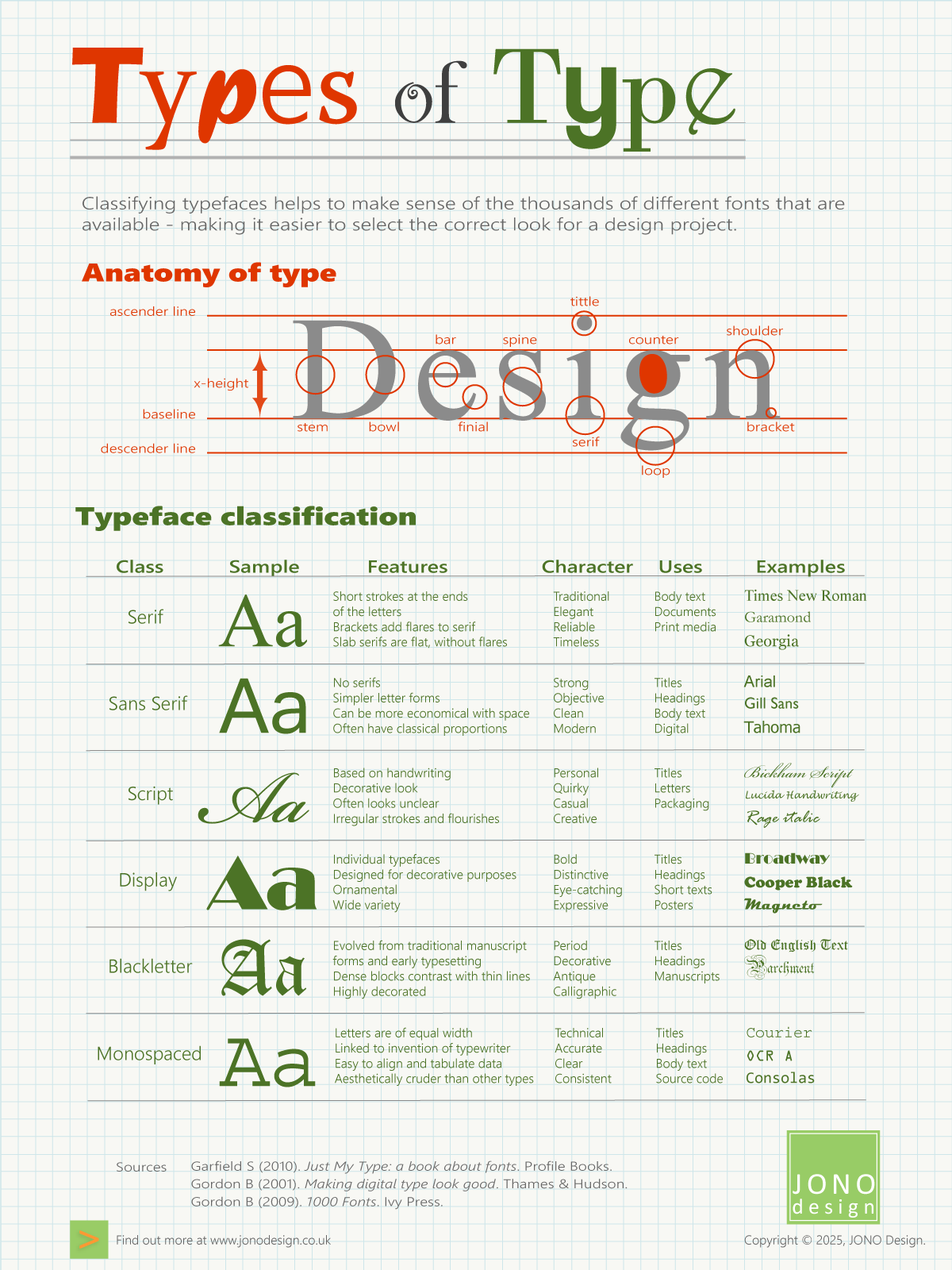
This infographic illustrates six main classes of type. While each of these main classes contains a range of sub-divisions and styles, they provide a starting point in describing the different ‘types of type’.
Click on the infographic to enlarge it.
The anatomy of type
The classification of type usually involves grouping together typefaces that share similar visual features – the strokes and flourishes that make up the letters and punctuation marks. Knowing some of the terminology used in describing the letter forms helps to understand how typefaces can be grouped together in ‘families’.
Some of the main terms are:
- Ascender line: an invisible line which is the height of an upward vertical stroke that extends above the x-height
- Bar: a horizontal stroke in a letter
- Baseline: an invisible line on which all the letters sit
- Bowl: a generally round or elliptical form that is the basic body shape of a letter
- Bracket: a serif joined to a stem by a smooth curve
- Counter: a white space enclosed by a letter
- Descender line: an invisible line marking the length of a downward vertical stroke that extends below the baseline
- Finial: a tapered or curved end on a letter
- Loop: the lower bowl of a letter ‘g’
- Serif: a stroke at the end of a stroke of a letter
- Shoulder: a curved stroke originating from a stem
- Spine: a main curved stroke of a letter
- Stem: a main straight stroke that is not part of a bowl
- Tittle: (also known as a dot) a small round mark above a lowercase ‘i’ or ‘j’
- x-height: the distance between the baseline and the height of the lowercase letter ‘x’.
Type classification
Francis Thibaudeau (1860-1925) categorised typefaces into families to create a font catalogue for a type foundry in 1921 (at a time when each letter was a metal or wooden piece and used in mechanical printing presses). Systems for the classification of type have since developed more categories to catalogue and group fonts together.
There is no single agreed classification for all the various fonts. However, the groups below can be used in general terms to organise typefaces together and to serve as a starting point for understanding the characteristics that certain types of type can bring to a design project. The fonts below are generally all available in Microsoft Office.
Serif
The Serif fonts have short strokes at the ends of the letterforms and are generally used for longer pieces of text. The style of the serifs can vary, including curved (bracketed), slab (straight without brackets), hairline, rectangular, or hooked.
Examples: Times New Roman, Garamond, Georgia.
Sans Serif
This class of typeface does not have serifs, producing a simpler letterform that provides a modern look. Sans Serif typefaces can take up less space than other categories as they are less decorated, and they are often used for headings and text.
Examples: Arial, Gill Sans, Tahoma.
Script
Typefaces in the Script class are derived from handwriting, making them more decorative and personal than either Serif or Sans Serif fonts. Typefaces range from simple, informal connected letters, to elaborate flourishes and irregular strokes that can be difficult to read.
Examples: Bickham Script, Lucida Handwriting, Rage Italic.
Display
Individually designed decorative fonts that do not fall into another typeface class can be described as a Display typeface, with each one being distinctive and original. These typefaces usually have an ornamental or decorative look in order to stand out and catch attention.
Examples: Broadway, Cooper Black, Magneto.
Blackletter
Blackletter type evolved from early written forms, manuscripts and printing, giving it a traditional or period feel. These typefaces are characterised by contrasting heavy and thin lines, along with dramatic decorations.
Examples: Old English Text, Parchment.
Monospaced
The letters and glyphs in Monospaced typefaces are all of an equal width, so they will always occupy the same amount of space on the page, making them easy to align and hence to tabulate data. The spacing reflects the fact that these fonts were developed for use in manual typewriters. Monospaced fonts are often used for coding and programming as they provide equal space for punctuation and letters.
Examples: Courier, OCR A, Consolas.
Sources
Garfield S (2010). Just My Type: a book about fonts. Profile Books.
Gordon B (2001). Making digital type look good. Thames & Hudson.
Gordon B (2009). 1000 Fonts. Ivy Press.
www.designhistory.org
This infographic appeared in JONO Design e-news. The e-news is published once every couple of months and each issue contains a specially designed infographic.
Click on the orange button to sign up for JONO Design e-news.

Get in touch to discuss your design requirements
or to request a quote.

enquiries@jonodesign.co.uk

Copyright © 2015-2026 JONO Design.
Designing solutions with Word